What is PowerPoint?
Microsoft PowerPoint is a graphical program that includes everything you need to make a presentation.
It is a slide show presentation tool with numerous features, bundled with Word, Excel, and other office productivity tools as part of Microsofts Office suite software. The software uses slides to communicate multimedia-rich information. The word slide alludes to the outdated slide projector that this program replaces.
Uses of PowerPoint
Advertisment
PowerPoint may be used for both amusement and business in a variety of ways. As a result, you can make a PowerPoint presentation for almost any occasion. Your creativity only limits the possibilities for using PowerPoint; here are a few examples:
Education: Teachers can use PowerPoint to teach classes, chapters of books, or the entire book on a single presentation. In this situation, they can create or delegate the creation of a comprehensive book presentation.
Business: Creating a plan, executing it, developing strategies, and making procedures and systems easier to follow and integrate are critical aspects of the company. A business strategy, organizational structure, execution methods, techniques, and the system can all be presented using PowerPoint.
Marketing: PowerPoint may also be used to make animated marketing films. You may embed it on your website or publish it to YouTube; PowerPoint offers some of the best animation effects and tools available. As a result, you dont need any additional animation tools to make use of these features.
Job Seeking: For competent professionals or job seekers, this is one of the most effective applications of PowerPoint. They can make a Digital Resume or a Multimedia Resume in PowerPoint. Its a novel approach to presenting abilities and information to interviewers and can be successful.
Presentation in PowerPoint tips
The following are a few tips on how you can maximize your PowerPoint experience:
- Create a consistent and simple design template with the slide master function. It is OK to modify the content in the presentation (i.e., bulleted list, 2-column text, text & image), but be consistent with other aspects such as font, colours, and backdrop.
- Reduce the number of words on each screen by simplifying and limiting them. Use key phrases and only add the necessary information.
- Use contrasting colours for text and background. Its ideal to use light writing on a dark background. Patterned backdrops can harm text readability.
- Text fly-ins and other showy transitions should be avoided. These features may appear spectacular at first, but they rapidly become distracting and tiresome.
- Excessive use of special effects, such as animation and sound, may erode your credibility.
- Use high-quality photos to support and enhance your message.
- If youre using builds (text lines that appear when you click the mouse), make sure the material appears on the screen in a consistent, straightforward manner; starting from the top or left is optimal. Because builds can slow your presentation, only \"build\" screens when necessary to convey your point.
- The number of slides should be kept to a minimum—presenters who keep moving to the subsequent slide risk losing their audience. One slide every 3 minutes is a good rule of thumb.
- Learn how to use non-linear navigation in your presentation. Without browsing through all of the interim slides, PowerPoint allows the presenter to skip ahead or back.
- Know how to move ahead and backwards in your presentation and practice doing so. Audiences frequently request that the initial screen be shown again.
- View your slides on the screen youll be using for your presentation if at all possible. Make sure the falls can be read from the back row. Text and graphical pictures should be legible but not so huge that they appear loud.
- In the event of technical difficulties, have a backup plan. Remember that animation and other special effects will not be visible on transparencies or handouts.
- Practice in front of someone who hasnt seen your presentation before. Please inquire about the colours, content, and any effects or graphical graphics youve added, and get their honest comments.
- Do not face your slides. Rather than facing their audience, many presenters face their presentations direction.
- Nothing in your presentation should be apologized for. Dont utilize something if you feel it will be difficult to read or comprehend.
Templates of presentations in PowerPoint
A PowerPoint template is a blueprint or pattern for a slide or set of slides you save as a.pptx file. Layouts, colours, fonts, effects, background styles, and even content may all be found in templates.
You may design your unique templates, which you can save, reuse, and share with others. On Office.com and other partner websites, you may also discover hundreds of various sorts of free PowerPoint templates to use in your presentation.
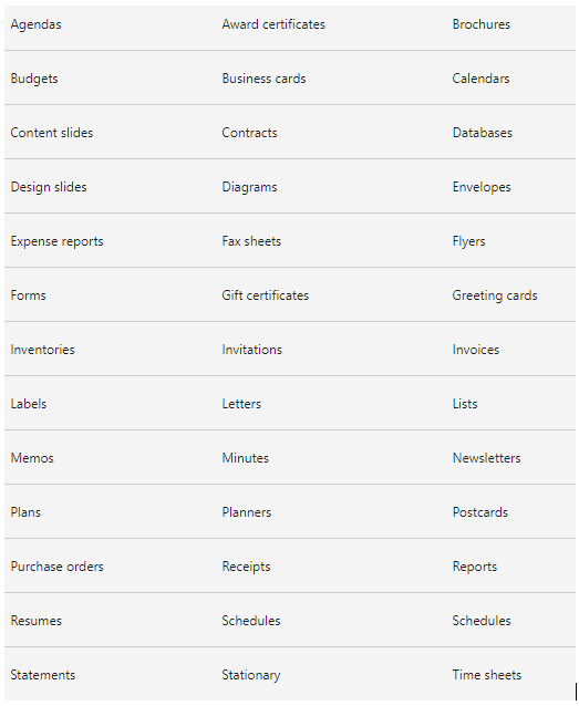
The following are just a few examples of templates available on Office.com for Word, Excel, and PowerPoint:

Making a powerful presentation in PowerPoint
Effective PowerPoint presentations are:
Well prepared: Professionally research, plan, and prepare your presentation. It enables you to communicate effectively with your target audience.
Designed well: Visual cues should pop without being too distracting to your audience. Your message should not be distorted by a complex PowerPoint presentation visual.
Well-rehearsed: Rehearse your timing and delivery with a live audience to ensure that your points land.
Presented confidently: Present with a confident outward projection and a peaceful inner-calm. Warmth, excitement, and vitality should be conveyed to the audience.
Reviewed for mistakes: Avoid errors like typos, crappy clip art, and reading directly from your slides.
Areas that will improve your PowerPoint presentation:
Applying data visualization principles effectively:
The graphical depiction of information and data is known as data visualization. Data visualization tools make it easy to view and comprehend trends, outliers, and patterns in data by utilizing visual components like charts, graphs, and maps.
Data visualization tools and technologies are critical in the Big Data environment to analyze vast data and make data-driven choices.
Colours and patterns attract our attention. We can easily distinguish between red and blue and a square from a circle. Everything in our society is visual, from art and commercials to television and movies.
You know how much more effective a visualization can be if youve ever gazed at a giant spreadsheet of data and couldnt detect a trend. We can easily see patterns and outliers while looking at a chart. If we can see something, we rapidly assimilate it. Its purposeful storytelling.
As such, presentations made in PowerPoint should consider data visualization principles to keep audiences engaged throughout.
Effective communication:
Communication is how information is conveyed or exchanged by speech, writing, or any other media.
To communicate effectively:
- Carefully consider your viewpoint before adding it to the presentation.
- Ensure that you have understood the assignment before compiling the presentation.
- Present relevant information only.
- Be concise and get straight to the point.
- Be wary of the effects of non-verbal communication.
- Have sound knowledge of the information being presented.
- Do not leave unresolved statements in your presentation.
Conclusion
Images and words are remembered better by humans than words alone. To present effectively on any matter using PowerPoint, keep the design of your slides or poster consistent and straightforward (fonts, colours) and make sure to use a combination of visualizations and text. Create an emphasis on the presentations main topics and ensure that you have maintained your audiences attention throughout the production.
Yolanda Chimonyo is a Strategy and Performance Management Consultant at Industrial Psychology Consultants (Pvt) Ltd, a management and human resources consulting firm.
Phone +263 242 481946-48/481950
Email: yolanda@ipcconsultants.com
Visit our website at www.ipcconsultants.com
